Small Home Office Colors for Focused, Comfortable Work
A work corner can look beautifully coordinated in a photograph and still feel awkward during an ordinary afternoon. The wall may seem much darker beside the monitor than it did on the sample card. The lamp changes the color after sunset. A shelf you enjoy in person looks unexpectedly busy on a video call.
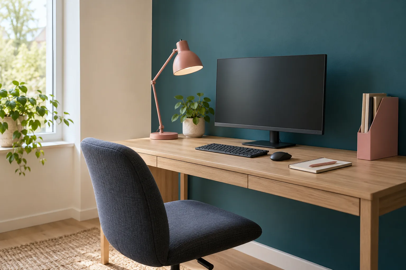
Useful small home office color schemes start with those everyday views. Choose a wall color and a few practical accents around the desk, existing finishes and light you have. No shade guarantees concentration; the aim is a setting you enjoy using. Petrol and dusty rose are the examples here, with several ways to adjust their balance to suit a small room.
Start with the desk and daylight
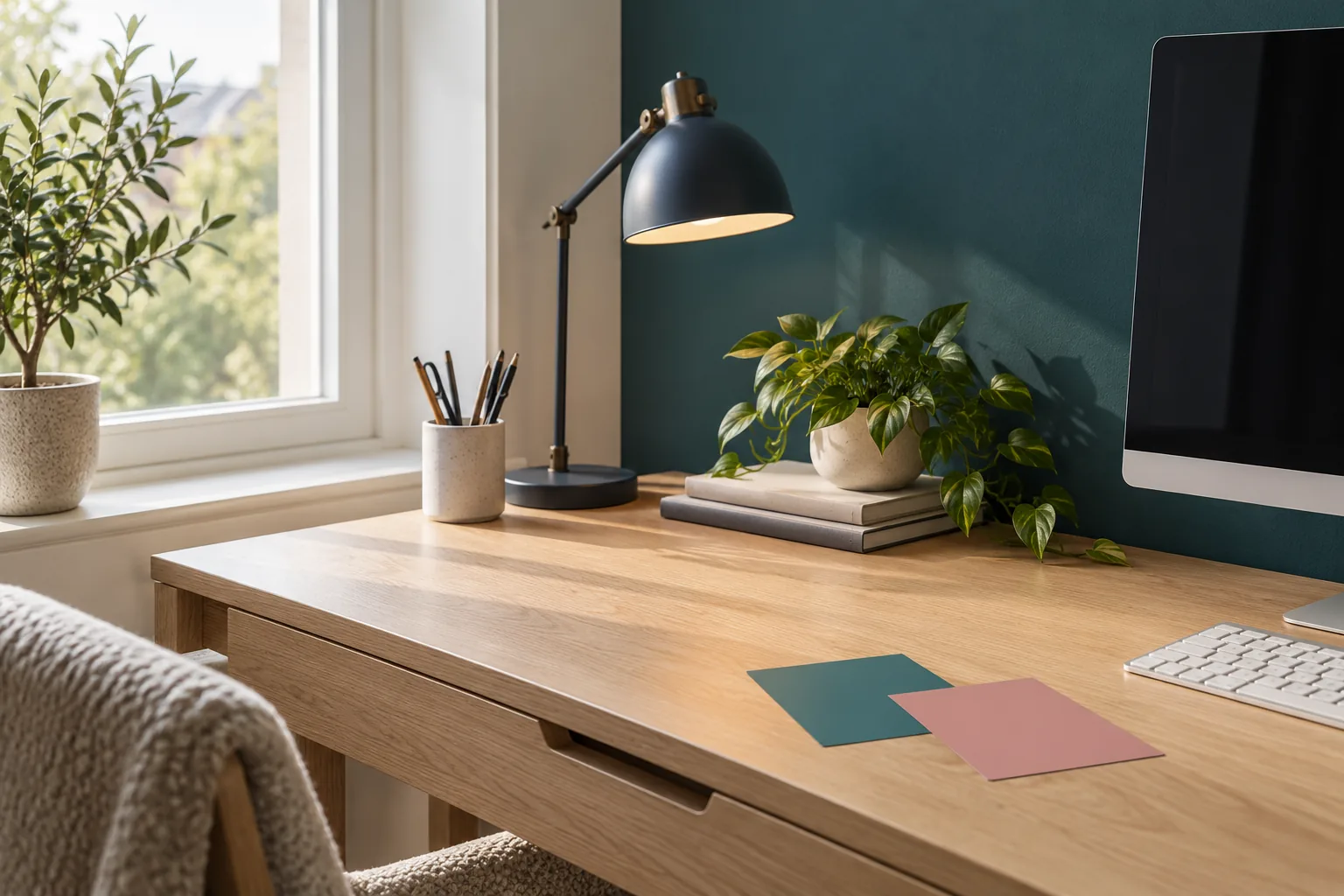
Look at what is staying before choosing paint. The desk, chair, flooring and window trim already create a palette, even if you never planned one. A warm oak desktop and a cool gray worktop will each change how the same petrol sample appears beside them.
Place a physical sample where the finished color would be seen, then sit at the desk. Check it close to the screen and farther along the wall. Return at different times and under the lamp you normally use after dark. A color seen only in strong morning light has not yet been tested against the workday.
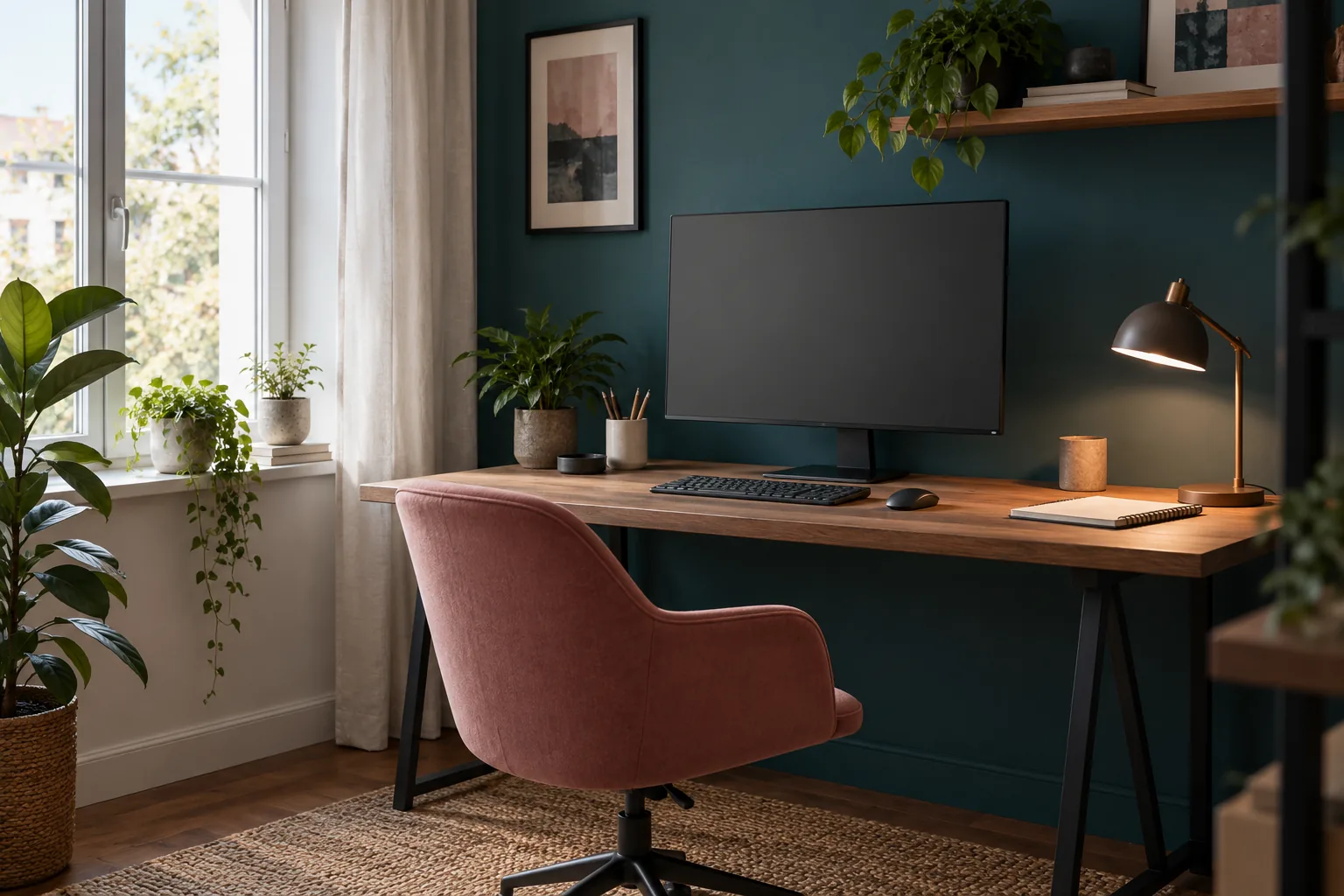
For a compact corner, try choosing one main color relationship rather than coordinating every surface. You could use a petrol wall, warm-white surroundings and a small rose file holder. Or keep the wall warm white and put petrol in a useful folder or desk accessory, with rose as a softer second accent. Both approaches can connect the corner to the home without replacing the desk.
If the location is still undecided, our guide to placing a desk in a small apartment compares possible positions. Settle that practical question first. Moving from a bright window-side wall to a dimmer alcove can change the color decision more than choosing between two similar paint names.
Use a lighter wall in a dim corner
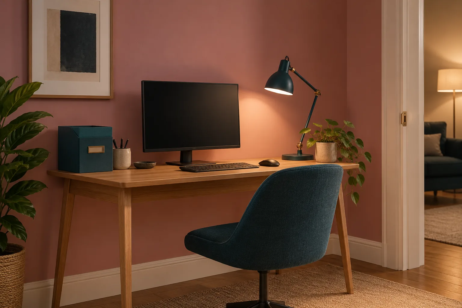
When the corner has limited daylight, compare a lighter surrounding color before committing to a deep one. A pale, muted rose can provide warmth without turning the wall into a strong dark block. Warm white is another option, particularly when petrol already appears in the chair, files or adjacent room.
The important test is the actual surface under the actual light. Some pale colors become much cooler or pinker beside existing finishes than expected. Look at a sample large enough to judge as a wall color, following the paint manufacturer's sampling guidance, and compare it with the desk and trim rather than with a bright white phone screen.
Keep lighting as a separate practical decision. A lighter paint does not create a usable reading light where one is missing. Check papers, keyboard and monitor during the activities you do here, and use appropriate lighting and workstation guidance for those tasks.
A deeper color may still be the one you prefer. In that case, try it on the wall you see most clearly and retain lighter surrounding surfaces if they make the setting more comfortable for you. You can also introduce the deeper shade through existing movable items first. That gives you time to decide how much of it you want before repainting a whole alcove.
Keep the video background calm
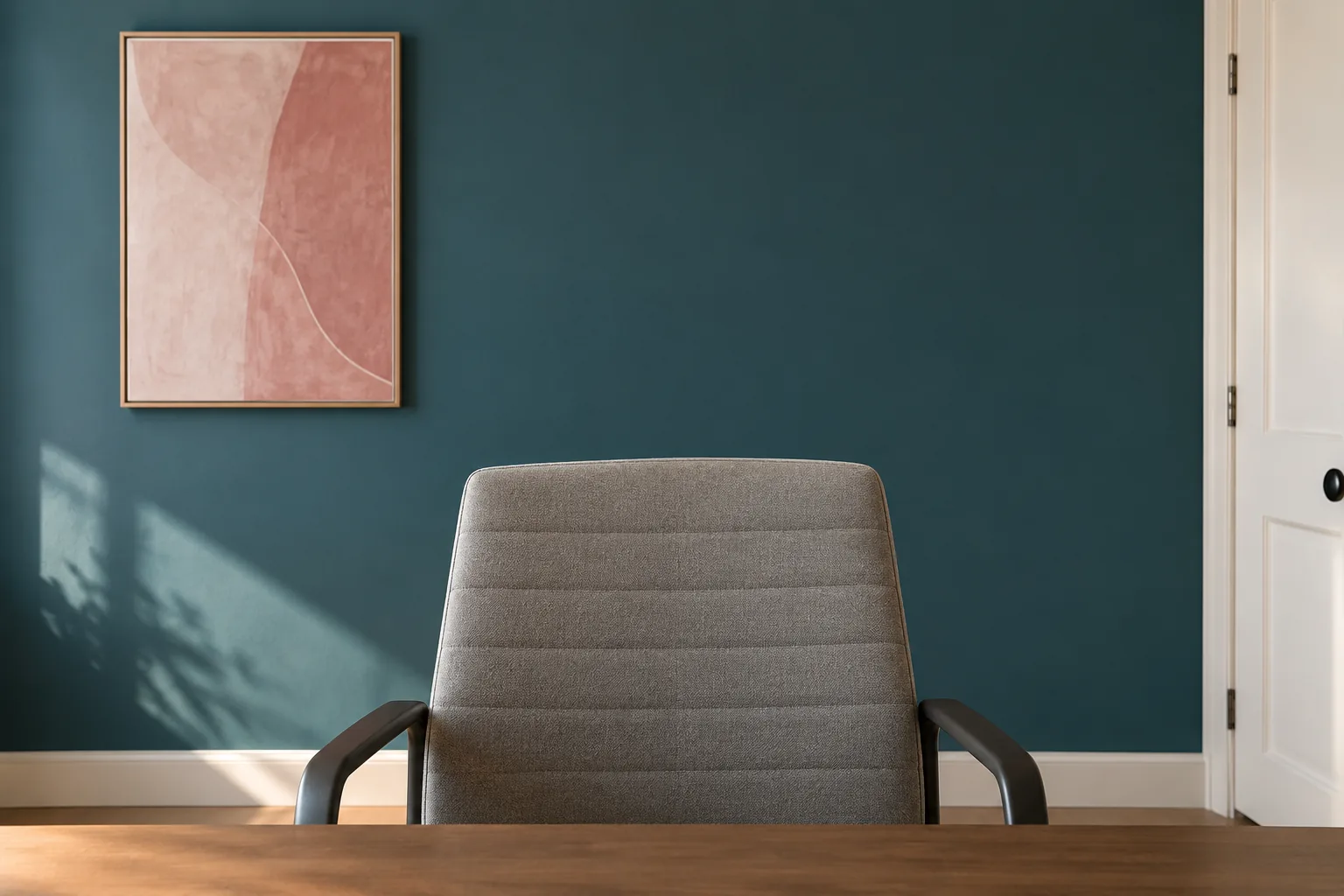
The wall behind the monitor is not necessarily the wall behind you on a call. Open the camera you normally use and check its actual view with the chair in your working position. A side doorway, a kitchen shelf or the room's strongest light may appear in the frame even though none of them belongs to the desk arrangement.
Start by simplifying that existing view. A quiet petrol field with one modest rose-toned artwork can be enough. You do not need a display shelf, a collection of matching books and several plants to make the background feel considered. Look at how much of the color the camera sees before painting a small patch that may disappear behind the chair.
Check the practical background too. Keep private documents and identifying information out of view where appropriate, and avoid relying on a partly closed door if people need to pass through it during calls. The room still has to function for everyone who uses it.
The color should look pleasant when the camera is off as well. For a shared living area, connect it to a cushion, existing artwork or another modest element already in the room. A small work corner can have a clear identity without becoming a permanent broadcast set.
Repeat accents in useful supplies
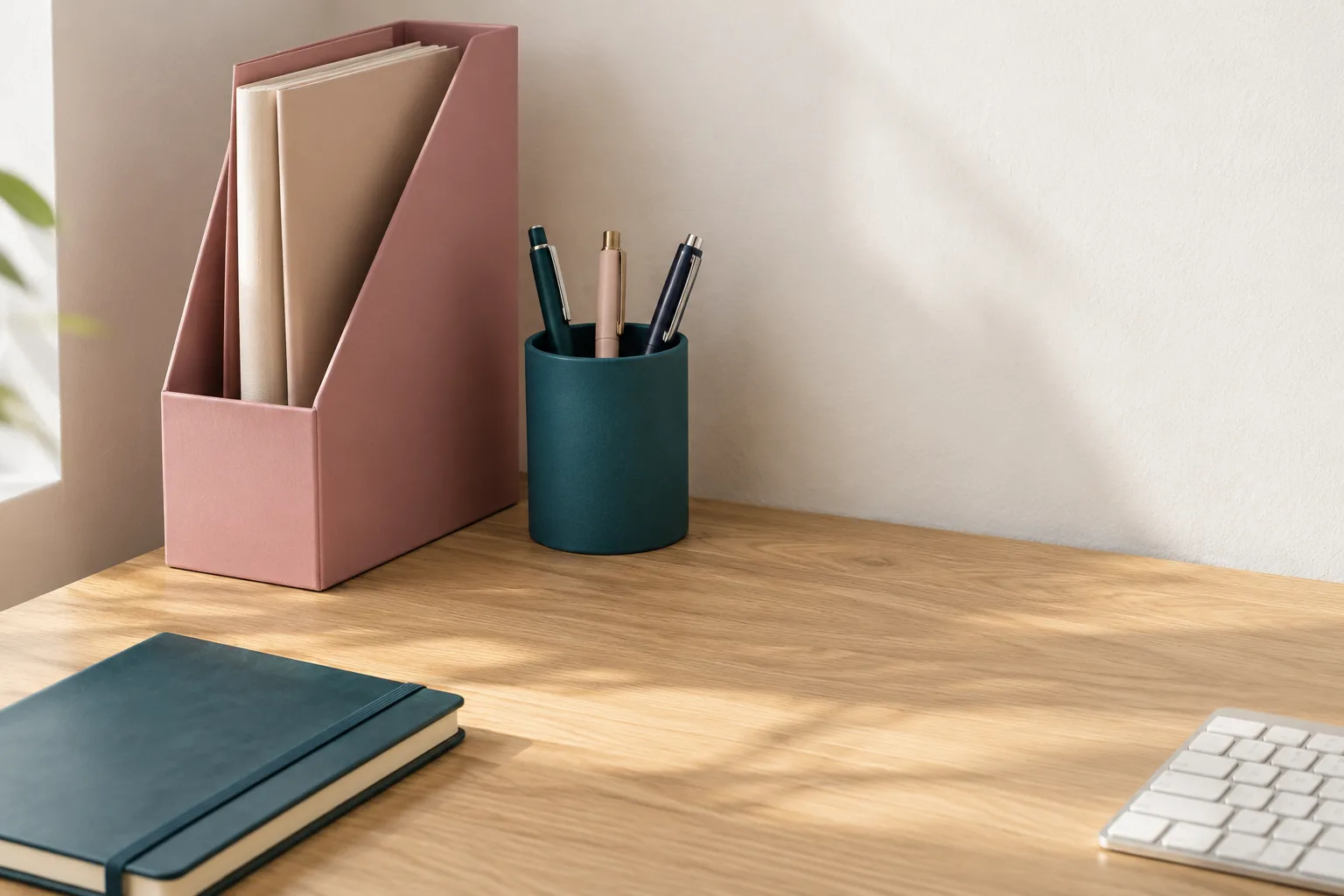
Let a few items that earn their place carry the accent color. A rose file holder can connect with a muted wall detail; a petrol pen cup can repeat a deeper color elsewhere. Begin with the items you actually reach for, then choose which of them will be visible.
You do not need to replace sound supplies to make this work. A plain folder inside a colored holder, a notebook you already own and the existing lamp may provide enough connection. Wood, metal and paper do not all have to match. A small repeated color is often easier to live with than a desk where every useful object has been replaced by a coordinated version.
Choose organizers by what they must hold. Check a file holder against the paper sizes and a tray against the current-work pile. A neat narrow box that bends documents or needs emptying to reach one sheet is a poor exchange for a perfectly usable mismatched folder.
Keep the accent group limited to the available space. A single colored holder at the back corner leaves more useful desktop than a row of empty containers bought to complete the palette. If the organizer needs a separate ornament to make sense visually, try removing the ornament and looking again.
Check screen glare and reflections
Assess the screen from your normal seat, with the window and room lights in ordinary use. Notice a bright reflection, a glossy accessory catching the lamp, or a large difference between the screen area and its surroundings. Color belongs in that assessment, but it is only one part of it.
OSHA's workstation-environment guide describes arranging the screen and lighting to reduce glare, including positioning the display at right angles to windows where practical. Use suitable window coverings and equipment guidance when assessing your own arrangement. Do not twist the monitor into an uncomfortable viewing position simply to make a reflection disappear.
Compare finishes as well as hues. A shiny desktop accessory or high-gloss wall near a lamp can create a different visual effect from a more matte surface in the same color. Before buying a glossy desk mat or repainting a wall, check the view from the seat rather than judging only the room's photograph.
Change one thing at a time so you can tell what helped: the lamp direction within its intended adjustment, a suitable window covering or the position of a reflective object. If the workstation remains difficult to use, seek advice appropriate to the actual setup. Paint cannot resolve every lighting or equipment-position problem.
Leave the working surface mostly clear
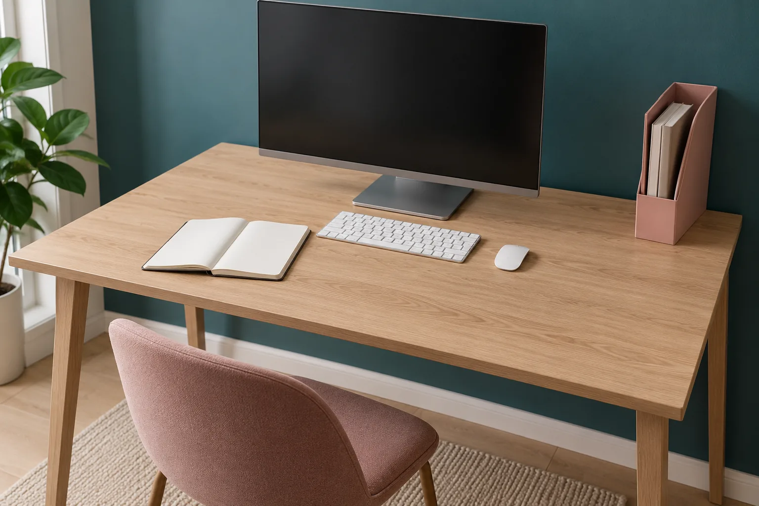
Give the desk enough space for its main task before deciding how to style it. For one person that means a monitor, keyboard and open notebook. For another it means putting the laptop away so a drawing sheet can lie flat. The color scheme should support that surface rather than gradually occupy it.
Keep the current-work group modest and give completed papers another home. A rose folder beside a petrol wall can remain useful; a permanent pile of attractive folders in front of the keyboard cannot. Check what happens when you open the notebook, use the mouse or spread out a reference page.
If you want more personality, use a suitable wall detail away from the working area. Our blank-wall decorating guide can help compare a single artwork with a small grouping. Choose proper support for the actual wall and piece, and keep controls and access clear.
Live with one color change for a few ordinary work sessions before adding another. Look at it during calls, in daylight and after dark. Stop when the corner feels connected and comfortable. It does not need more accessories to prove that the palette is complete.
What is the best color for a small home office?
There is no universal best shade. Begin with the desk, available light and colors you enjoy seeing for extended periods. Compare physical samples from the actual seat. Petrol and rose offer one possible relationship, but a lighter wall with a small deeper accent may suit a particular corner better than a whole dark wall.
Can I create a color scheme without painting?
Yes. Keep the existing walls and choose one or two useful accents in supplies or a suitable textile you already need. Repeat a color from the adjoining room to connect the work corner. Avoid replacing working equipment or filling the desk with decor simply to introduce more color.
Should my call background match the wall behind the desk?
It can relate to it without matching exactly. First check what the camera actually sees, then choose a modest color relationship that also works in the room. A calm background with one related detail is often enough; protecting the room's movement and ordinary use matters more than creating a perfectly coordinated frame.
Choose the palette from the working position
Keep the desk and its light in the decision from the beginning. Test a wall color, add a useful accent and check the view through the day. The result can feel personal and colorful while leaving the actual work surface ready for use.
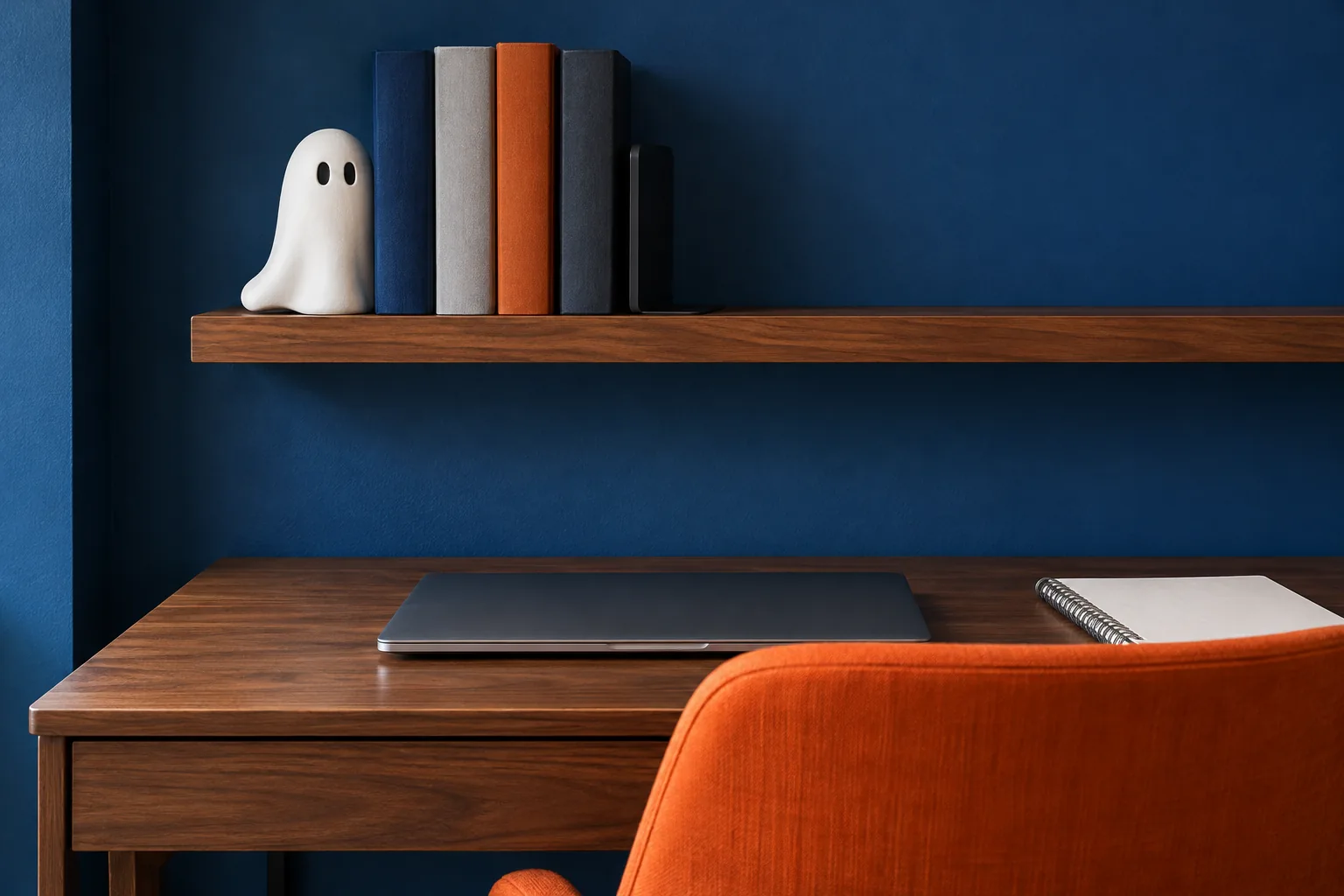
Images are AI-generated examples of different office arrangements, not before-and-after evidence, ergonomic assessments or proof that a color improves concentration.
A beautiful small space is not about having more. It is about making what you have work better. — Spacelya